Wednesday, March 18, 2009

Final Blog Reflection

Design thinking is the many ways in which individuals believe that design should be taught, used and implemented.  The modernism take of the precise using of technique and form has been the basis of our education and the design world for years but different views have rivaled this way of rigid thinking.
Bruce Mau's manifesto encourages the reader, (hopefully a designer) to think outside the box.  Take the modernism approach to design a step further and go deeper into design, pushing the boundaries and experiment with what was/is viewed as "good" design.  
Taking it a step further is Meredith Davis' keynote on mapping and effective design.  Designers with her outlook think that design is almost entirely going digital with the many websites and technologies becoming readily available to, essentially, consumers and customers.  The emphasis and importance of design is put in the IDEA itself in the way of mapping and brainstorming, where in can be implemented digitally or with technology.  Modernists would think that this kind of design takes away from the practice itself because there is less emphasis on the form, composition, and the actual physical result.
In the same way Andrew Blauvelt's take on design is how it has broadened to the idea and not just the physical piece itself.  The creation of systems has more intrinsic value than a single product, and the focus, in his opinion, should be on interactive design to be up to the times.
IDEO puts an emphasis on humanistic design as the most important factor to design.  Designing systems of development to better our community or the community of those without our resources in the United States.  This strays away from any kind of product to sell but, like Meredith, focuses on the idea, the brainstorming and it's effect on the systems of the world around us.
I personally think that each approach has it's pluses.  Modernistic design allows you to have an effective aesthetic implementing form, type, and composition, etc. that is marketable and useable in todays design fields.  It trains and hones your artistic eye.  However digital design is becoming more and more prominent and can't be ignored.  Mapping and human centered design is very important to society and communities and for students to learn but maybe in a much higher level of education, or even as an option as it can be a preference in this large design field.

Project 3 Final

My final product for our project 3 revision piece.  All of my inspiration and process are describes in earlier posts, this was an individual project.

Wednesday, March 11, 2009

Individual Reflection

For my last reflection writing I thought I would look into advertising design.  Last "critique" Bertus told me that my design for project 3 reflected a kind of advertising feel so I thought I would find an article about that.  Well I found a whole website:

http://marketingadvertisingdesign.com/

Tim Kenney Marketing is a full-service strategic marketing and graphic design firm located in metro Washington DC.  And this website is a compilation of links and articles about their design strategy.  Down the page there are articles on designing effective ads, branding, and fonts for advertising but I'll just choose, "Building a Case for Brand Identity" seeing as though our 1st project (and indirectly my 3rd) was based around branding.

It was interesting to read the differences between product and branding.  How a product is the actual physical thing and is defined by it's form and function.  The brand is the idea, concept or the character behind a product, event or business.  It invokes thoughts, feelings, and associations to the customer and even employees as to what the product is really all about.

Project 3 Process: Type Variations


I played around with the type.  Different weights, sizes, compositions, rotations, etc.  I wanted a contemporary, sans serif typeface to compliment the script embellishments at the bottom so I stuck with Ariel and Helvetica.  I also played with that one embellishment but this time in the counter of the "O" in Passion.  I'm still not sure If I'll use it at all or if I do which "O" to put it in.
In general I think the type looks best when it's towards the right utilizing the white space and not going past the "F" in the title.

Project 3 Process: Color Variations


After the critique I added in more flourishes behind the black ones in different colors but I ended up using the same pink as the title.  In the last variation I also played with the idea of there being an embellishment inside the counter of the "O"  in "fashion."  I'm still not sure If I will use it.

Project 3 Process


I finally found the perfect photo with the right look, colors, resolution, feel, dimensions, and white space for what I was thinking about.  I put in the title and type but it looked empty so I cut sections of a script typeface and added flourishes in the corner with dots to add a contemporary feel.  I pulled the pink from her top into the title to add emphasis to "passion" and balance to the composition.

More Inspiration


Project 2 Inspiration Continued


I also looked for fashion posters already designed for other events, looked at their use of type, their typefaces, and it's relationship to the photograph used.

Project 3 Inspiration


I wanted to base my design off of an actual photo rather than my own artwork this time.  I spent many hours on the internet looking for a picture I could use for a poster base.  I liked all of these but they either had too little or a too complicated background, the resolution and dimensions were off, the feel of the model and her clothes didn't reflect the show I am designing for, the colors were wrong, etc.

Monday, February 23, 2009

Project 2 Photos


Project 2 Process Description

WHAT I WAS RESPONSIBLE FOR AND MADE
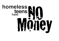
At the beginning we both sat in class and made a list of things we were interested in making and skills we knew we had such as calligraphy, bookmaking, sewing etc.  We knew we wanted to go beyond a design printed on paper and we both agreed fairly quickly that we wanted to focus on the causes of teen homelessness.  We then said that we would go home and find pictures/sources of inspiration, initially thinking that we would make a book.  We also gathered as much information and articles on homeless teens as we could. Then we decided that designing and making a book would take too much time for the time we had to get the project done and switched to the idea of presenting our data in a mobile.  Originally we had the idea of making it our of cardboard and painting on our statistics but agreed it would be too difficult. We then sketched a rough brain storm map developing our main causes like No School, or Violence in the home.  We split them up between us, went home, and if it was needed we found additional research to add to our map which we made/wrote/drew on a big board for class.  After the mind-map Jordynn made a very useful diagram showing our causes and how they "fell" on the mobile and connected to other issues.  For homework we found type inspirations for the fonts and overall look of the "cards" and agreed on a style and 2 typefaces.  Again, splitting up the cards having 10 each, we went home and typed out and designed each card, we had very little trouble getting the same looking cards and I personally soon forgot which ones I did and which ones she did.  Which is perfect because we want them to become a cohesive project naturally.  We measured cards, making the causes at the top bigger and progressively become smaller as you go down the mobile, printed, pos/neg., and copied the cards, cut them out, pasted them on the boards, made the right amount of holes for each card in the right place (Jordynn supplied the beautiful string and assigned a color to a card) and we started threading them together until we got the end product.
WHAT DID vs. DIDN'T WORK
I think as a group Jordynn and I work very well together, we get stuff done, and pull our weight, both come up with ideas and have the same inclinations and standards as far as process, style, and craft. 
I think the "title" or top card holding the mobile together was too flimsy, it would have been nice if it was stronger poster board.
The string worked very well in my opinion but we wanted to show a intricate and maybe even confusing amount of connections between the causes.  I thought the design as a design looked better without the extra strings through the middle but like i said we needed them to portray the intent of the design.
INSPIRATIONS
I saw a mobile with type on it a while ago that I liked and wished I could try.  My type inspiration came from my research (which I posted earlier).

Human Centered Design Reflection

I had trouble looking at this report or toolkit because it's very long and confusing but it also seems to me as a sort of social activism and less actual design.  It's a proposal for a system or a program but I'm having trouble seeing any actual physical, visual design element.   So I looked at what Human Centered Design actually was and found these links:

I found this website for a "design consultancy helping companies and organisations to innovate their products, services and processes by putting people and their experiences first."
http://www.experientia.com/

I found a 17 min. video about human centered design at TED which really helped me visually see what can be possible design wise. (They also show designed games in a museum, which we kind of talked about in class.)
http://www.ted.com/index.php/talks/david_kelley_on_human_centered_design.html

So with these in mind I took another look at the HCD toolkit and read that they would use it for technology adaptation for hygienic plumbing/water systems.  

Monday, February 9, 2009

Rough Mobile Card Layouts


Rough Mobile Card Layouts


Small Article Clipping

Causes of young people becoming homeless

There are many reasons why young people become homeless - it could be any one or more of the following:

Problems at home, eg. feeling unsafe, being abused, fighting between parents, fighting between siblings, feeling unwanted, parents' divorce, trouble with a parent's new partner, a new baby in the house, money worries, too many rules, not enough rules, not getting on with foster parents.

Problems at school, eg. bullying, teasing, finding schoolwork too hard or too easy, problems with teacher(s), not having any friends.

Problems with peers, eg. peer group pressure, teasing, spreading rumours, sexist or racist harassment.

Problems with the law, eg. drinking, drug use, stealing, graffiti, vandalism, assault, involvement with gangs, breaking in.

Problems with boyfriends/girlfriends, eg. breaking up, being dumped, not wanting to take 'no' for an answer.

Sunday, February 8, 2009

More Teen Homelessness

Looking for more resources for information on homeless teen causes, this time specifically medical issues.  The links are interesting but as far as health causes and correlations to homelessness for TEENS the only thing I seemed to find was that they were twice as likely to have learning disabilities.

http://www.cyh.com/HealthTopics/HealthTopicDetails.aspx?p=243&np=295&id=2456
http://www.dosomething.org/actnow/tipsandtools/background-11-effects-teen-homelessness
http://www.ehow.com/about_4602054_teen-homelessness.html

-Jordynn and I are lining up a talk with Joy at P;EAR on Tuesday, we'll see if it works out.

more inspiration


More things to look at, I also found a cool typography/ design blog:
http://noneedtoshout.blogspot.com/

Project 2 inspiration


I gathered some examples of txt layout and compositions for inspiration for our cards hanging from our mobile.  Obviously because of time constraints we won't be able to do anything this involved but visuals are always good to spring board off of.  Type faces and colors will obviously be very different than these in our project.

Monday, February 2, 2009

Andrew Blauvelt Reflection

Andrew Blauvelt's article was also extremely difficult to follow.  It was also very similar to our last reading so It's hard to get a long involved response written thats different from the last one. 
The first statement that caught my eye was, "the nature of design itself has broadened from giving form to discrete objects to the creation of systems and more open-ended frameworks for engagement: designs for making designs."  It's interesting how our world is broadening to these vast networks of information, where someone can buy their groceries and Christmas presents online.  Designers today will need to be able to design things in a relational way to cater to the more networked customers.
Design today is multi-faceted and interactive.  Like our last project, the fashion show, we're not just designing a logo, or a poster but the website, and the program, which is made to get people to buy and link to other organizations and stores.  
One of the things I was thinking when reading this article was that I wished I had visuals so they could show us what he means
I also wanted to look up the actual definition of "Interactive Design."   http://en.wikipedia.org/wiki/Interaction_design
Heres a site for international interaction in the design community where you can read and comment on forums talking about interaction design issues:     http://www.ixda.org/about.php
Heres another site for a creative design resource of other artists focused on interactive design:  http://www.commarts.com/interactive
I agree that "the nature of design and roles of the designer and consumer have shifted dramatically" and will probably continue to change as technology changes the face of how we interact with each other.

Monday, January 26, 2009

Meredith Davis Keynote Reflection

I found this article interesting because there seemed to be two contrasting viewpoints.  Or a strong viewpoint which is "questioning" the older, frequently used one.  I soon came to realize that the viewpoints are ones that I have seen in my teachers as I take classes from PCC.  I would be reading a paragraph and think to myself, "That sounds just like this teacher."  
I have teachers who have told me that "The computer is just a tool."  Where we have been encouraged in other classes to start with the computer and encouraged to know as many facets of the technology available to us as possible.  I personally think that a balance of both is practical and preferable to the way I like to work.  I like to work alone on single pieces of design art, but I have also found and see an importance to working in a group for something more communal. I have done both kinds of design, enjoy both, and can see the pro's and con's on each side of the spectrum.  
I think something to take into consideration, especially when the article moves into the importance of technology and community, is that the world is going digital.  Everything is on the web now.  You can read books, go shopping, learn sign language, talk with long lost friends on the opposite side of the world, have a digital portfolio that anyone can see, etc.  Not only are you as a designer "sold" or broadcasted on the internet but there is this plethora of information, images, ideas, and inspiration to glean off of the internet and the whole world is joining in.  You can't go to school today without a computer, businesses have to have websites, and designers have to have websites.
Here is my website of DeviantArt.  http://rustedangel7.deviantart.com/  This is a website where artists can post their creations in a gallery online.  It's free of charge and built specifically for artists who want to network, share, and browse other works.  People post their  mini films, animations, designs, illustrations, sculptures and whatever else they want to share.  They give you a favorites list where you can bookmark your favorite artist and get notices when they have added more to their gallery.  I go on almost everyday and look at my favorite artists' new submissions, tutorials they've made and read about media, programs and techniques they used to make their artwork.
I took a look at the two examples of "design" in Apple.com and Amazon.com to get a visual with the keynote.
www.apple.com
www.amazon.com

Friday, January 23, 2009

Process Description

                WHAT I WAS RESPONSIBLE FOR AND MADE
      At the beginning of the project we all decided to go home and sketch up many different ideas for branding proposals to bring to the table and vote on as a group.  Everyone came to the conclusion that they liked my "branches" idea and that we wanted it to have it done in real media vs. digitally done.  So Jordynn and I got together during the weekend and I spent the better part of a friday drawing pages of branches, passion flowers and painting brush strokes with india ink and watered down acrylics.  I scanned everything we did in and e-mailed to everyone in the group.  While the others were working on logos and formatting I went into Adobe photoshop and illustrator, imported the images, and put them together coloring the paint strokes and whitening the branches.  Now that we had our branding I e-mailed it to everyone and made an additional "backstage" larger illustration for the stage.  I then was put in charge of making the website which I brought to class and got critiqued on and which was eventually given over to mark because I was asked to do the Poster and Handbill. 

              WHAT DID vs. DIDN'T WORK
        I think our group did a really good job of working together, meeting outside of class, and making decisions together.  Everyone had a say and was happy to hear and consider the other group members decisions.  Everyone was extremely willing to put in the time and effort into their share of the project.
Sometimes there were difficulties in splitting up jobs because of the nature of the jobs themselves.  For example I felt bad that Jordynn was always in charge of bringing/ keeping the poster board but she was the only one who lived on campus.  Or we had the poster and handbill to do but instead of giving 2 people one each to do we gave it to one person because they are so similar and we wanted the pieces to have a cohesiveness.  Or we wanted everyone to work on the actual painting in the beginning but some people had work, others couldn't make it but if we did it all separately on our own we would all spend hours on different styles of painting that might not be used in the end.

INSPIRATIONS
Initially I was inspired by the willow branch which has such character and texture and thought they would be white with a very faded very soft greenish grey in the background.  We were told in class that we needed bright bold colors for advertising purposes so splashes of color seemed to be something modern and fun that could add an extra punch.
I looked at Anthropologie (www.anthropologie.com) for inspiration.  I used to work there and it seems to me like a very earthy, fashion, store and I always always enjoy their branding.
I also have pieces/photos of inspiration in my first post.

www.anthropologie.com
http://nymag.com/fashion/fashionshows/
http://www.vogue.co.uk/
www.sustainablestyle.org

Final Banner Proposal

Heres our final Banner, although we stuck "May 20th" at the bottom.  We went for the simple look again, with a long vertical format so it can either hang or stand our from street poles.

Final Website Proposal

Our final website proposal done by Mark.  I think he did a good job incorporating the elements we were told were important and putting them together, especially for the time restraints we had.   I'm interested in maybe designing a page for our 3rd project.  Taking this idea but putting the time and effort into making a website page.

Final Logo proposals


Our favorite logos, we ended up putting them all on our proposal board for them to choose although we chose the first scroll flourish one as the title for the board itself.  We decided on this one because the format was what we had room for next to everything else on the board.