Monday, February 23, 2009

Project 2 Photos


Project 2 Process Description

WHAT I WAS RESPONSIBLE FOR AND MADE
At the beginning we both sat in class and made a list of things we were interested in making and skills we knew we had such as calligraphy, bookmaking, sewing etc.  We knew we wanted to go beyond a design printed on paper and we both agreed fairly quickly that we wanted to focus on the causes of teen homelessness.  We then said that we would go home and find pictures/sources of inspiration, initially thinking that we would make a book.  We also gathered as much information and articles on homeless teens as we could. Then we decided that designing and making a book would take too much time for the time we had to get the project done and switched to the idea of presenting our data in a mobile.  Originally we had the idea of making it our of cardboard and painting on our statistics but agreed it would be too difficult. We then sketched a rough brain storm map developing our main causes like No School, or Violence in the home.  We split them up between us, went home, and if it was needed we found additional research to add to our map which we made/wrote/drew on a big board for class.  After the mind-map Jordynn made a very useful diagram showing our causes and how they "fell" on the mobile and connected to other issues.  For homework we found type inspirations for the fonts and overall look of the "cards" and agreed on a style and 2 typefaces.  Again, splitting up the cards having 10 each, we went home and typed out and designed each card, we had very little trouble getting the same looking cards and I personally soon forgot which ones I did and which ones she did.  Which is perfect because we want them to become a cohesive project naturally.  We measured cards, making the causes at the top bigger and progressively become smaller as you go down the mobile, printed, pos/neg., and copied the cards, cut them out, pasted them on the boards, made the right amount of holes for each card in the right place (Jordynn supplied the beautiful string and assigned a color to a card) and we started threading them together until we got the end product.
WHAT DID vs. DIDN'T WORK
I think as a group Jordynn and I work very well together, we get stuff done, and pull our weight, both come up with ideas and have the same inclinations and standards as far as process, style, and craft. 
I think the "title" or top card holding the mobile together was too flimsy, it would have been nice if it was stronger poster board.
The string worked very well in my opinion but we wanted to show a intricate and maybe even confusing amount of connections between the causes.  I thought the design as a design looked better without the extra strings through the middle but like i said we needed them to portray the intent of the design.
INSPIRATIONS
I saw a mobile with type on it a while ago that I liked and wished I could try.  My type inspiration came from my research (which I posted earlier).

Human Centered Design Reflection

I had trouble looking at this report or toolkit because it's very long and confusing but it also seems to me as a sort of social activism and less actual design.  It's a proposal for a system or a program but I'm having trouble seeing any actual physical, visual design element.   So I looked at what Human Centered Design actually was and found these links:

I found this website for a "design consultancy helping companies and organisations to innovate their products, services and processes by putting people and their experiences first."
http://www.experientia.com/

I found a 17 min. video about human centered design at TED which really helped me visually see what can be possible design wise. (They also show designed games in a museum, which we kind of talked about in class.)
http://www.ted.com/index.php/talks/david_kelley_on_human_centered_design.html

So with these in mind I took another look at the HCD toolkit and read that they would use it for technology adaptation for hygienic plumbing/water systems.  

Monday, February 9, 2009

Rough Mobile Card Layouts


Rough Mobile Card Layouts


Small Article Clipping

Causes of young people becoming homeless

There are many reasons why young people become homeless - it could be any one or more of the following:

Problems at home, eg. feeling unsafe, being abused, fighting between parents, fighting between siblings, feeling unwanted, parents' divorce, trouble with a parent's new partner, a new baby in the house, money worries, too many rules, not enough rules, not getting on with foster parents.

Problems at school, eg. bullying, teasing, finding schoolwork too hard or too easy, problems with teacher(s), not having any friends.

Problems with peers, eg. peer group pressure, teasing, spreading rumours, sexist or racist harassment.

Problems with the law, eg. drinking, drug use, stealing, graffiti, vandalism, assault, involvement with gangs, breaking in.

Problems with boyfriends/girlfriends, eg. breaking up, being dumped, not wanting to take 'no' for an answer.
Sunday, February 8, 2009

More Teen Homelessness

Looking for more resources for information on homeless teen causes, this time specifically medical issues.  The links are interesting but as far as health causes and correlations to homelessness for TEENS the only thing I seemed to find was that they were twice as likely to have learning disabilities.

http://www.cyh.com/HealthTopics/HealthTopicDetails.aspx?p=243&np=295&id=2456
http://www.dosomething.org/actnow/tipsandtools/background-11-effects-teen-homelessness
http://www.ehow.com/about_4602054_teen-homelessness.html

-Jordynn and I are lining up a talk with Joy at P;EAR on Tuesday, we'll see if it works out.

more inspiration


More things to look at, I also found a cool typography/ design blog:
http://noneedtoshout.blogspot.com/

Project 2 inspiration


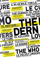
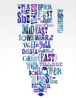
I gathered some examples of txt layout and compositions for inspiration for our cards hanging from our mobile.  Obviously because of time constraints we won't be able to do anything this involved but visuals are always good to spring board off of.  Type faces and colors will obviously be very different than these in our project.

Monday, February 2, 2009

Andrew Blauvelt Reflection

Andrew Blauvelt's article was also extremely difficult to follow.  It was also very similar to our last reading so It's hard to get a long involved response written thats different from the last one. 
The first statement that caught my eye was, "the nature of design itself has broadened from giving form to discrete objects to the creation of systems and more open-ended frameworks for engagement: designs for making designs."  It's interesting how our world is broadening to these vast networks of information, where someone can buy their groceries and Christmas presents online.  Designers today will need to be able to design things in a relational way to cater to the more networked customers.
Design today is multi-faceted and interactive.  Like our last project, the fashion show, we're not just designing a logo, or a poster but the website, and the program, which is made to get people to buy and link to other organizations and stores.  
One of the things I was thinking when reading this article was that I wished I had visuals so they could show us what he means
I also wanted to look up the actual definition of "Interactive Design."   http://en.wikipedia.org/wiki/Interaction_design
Heres a site for international interaction in the design community where you can read and comment on forums talking about interaction design issues:     http://www.ixda.org/about.php
Heres another site for a creative design resource of other artists focused on interactive design:  http://www.commarts.com/interactive
I agree that "the nature of design and roles of the designer and consumer have shifted dramatically" and will probably continue to change as technology changes the face of how we interact with each other.